SafeWalks: Helping people feel safe walking at night (UX Case Study)
Originally published at UX Collective · January 1, 2019
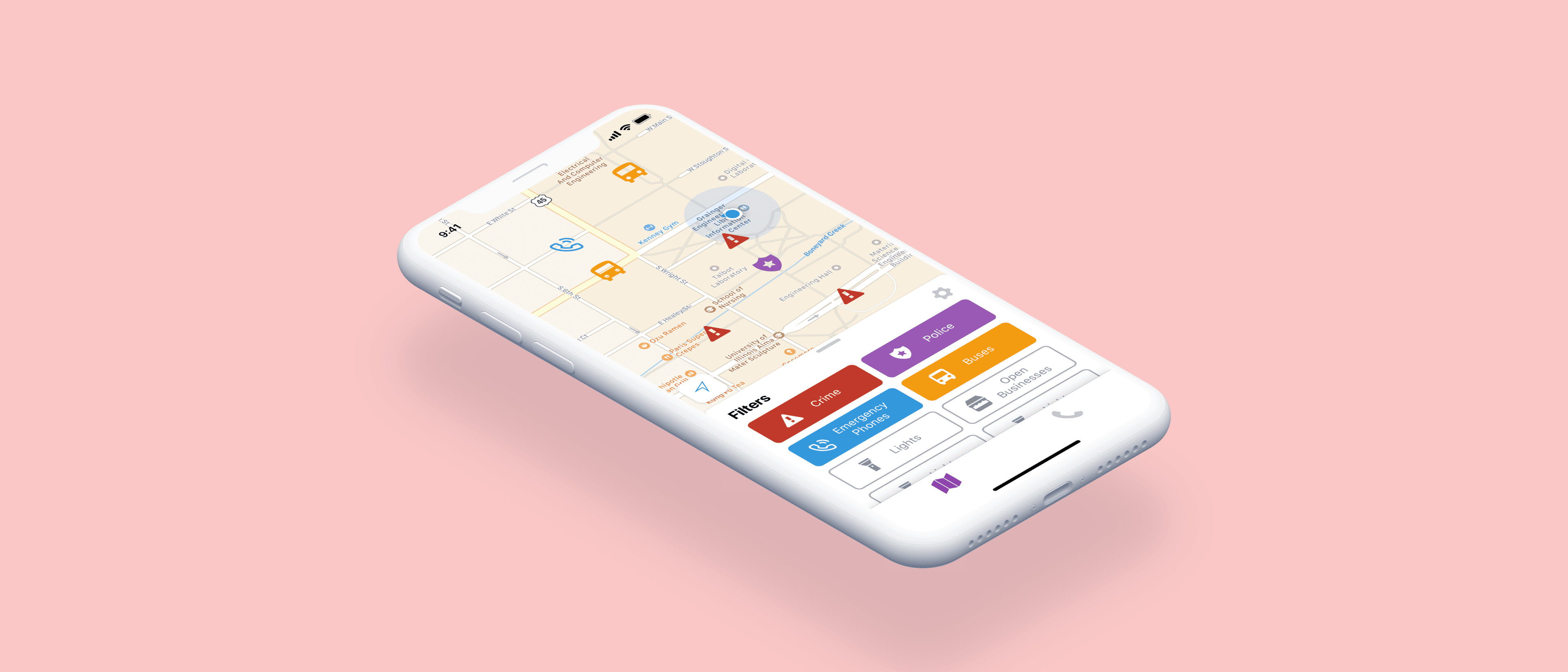
The Challenge
Walking around campus alone at night can be scary, some streets are deathly quiet and many are not well lit. According to the National Crime Victimization Survey, 63.2% of rapes and sexual assaults occur after dusk. Often, the victims were alone.
A project that I worked on with Hack4Impact hoped to address this issue: designing an app to help students determine the safest route when walking late at night. We wanted to reduce the rate of crime targeting pedestrians by providing them with useful information regarding their surrounding areas. This way, they can make better decisions when walking at night and achieve peace of mind.
My Role
My role was to be the UI/UX engineer for an 8 person team that consists of a product manager, a tech lead, 4 developers, and 2 designers. During the course of a semester, I worked alongside developers to create a working prototype that is truly user-centered.

The Pain Points
Currently, there is information available online — such as locations of past crimes or emergency phones — that can be helpful in deciding what route to take. However, there are various problems when people want to use the info in this purpose:
- these data are not easily accessible on mobile platforms, as they’re often in the form of a website or PDF designed for desktop browsers
- there’s no centralized place to see the various information
- the available data does not automatically correlate to a pinpoint on a map, making it difficult for users to process the data
- students new to campus don’t know where to find these data
“The info is out there, but it’s hard to utilize it.”
User Needs
While coming up with the initial concept of our solution as a team, we had the following points in mind:
- it should put all available info that’s out there in one place to help users determine what area is safer
- it should be a mobile app so users can see the info whenever, wherever
- users must be able to find the info they need very quickly
- info has to be presented in a way that can be easily understood
- the design must be simple because of possible reliance on the app during emergency situations
- the interface must be suitable for use while walking at night (i.e. when the surrounding environment is dark)
- users of all demographics should find the interface intuitive and not too different from the apps they are already used to using
User Research
Our user research was considered an integral part of our development process, as we are developing the app for a non-profit client, Cut to The Case, and our primary focus is our users.
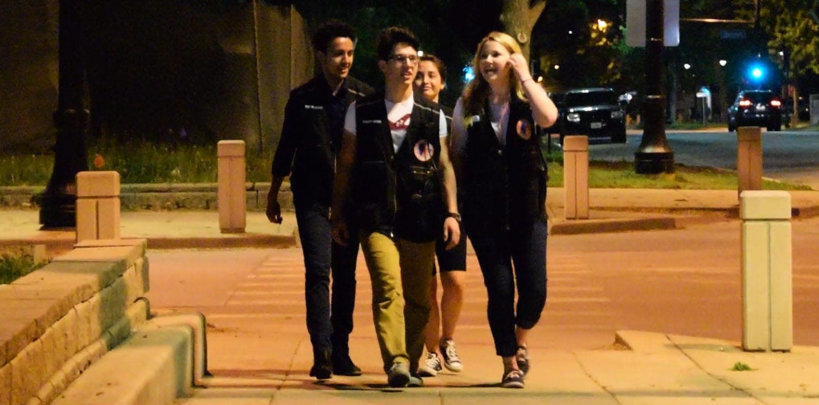
While brainstorming our initial concept of the app, we interviewed the university authorities to gain a better understanding the safety scenes on campus — specifically, the usage statistics and user demographics of the university services that aims to provide safer transportation at night, SafeRides and SafeWalks.
“Throughout the night, SafeRides users are mostly international students traveling from libraries. Later in the night, they’re mostly people traveling from bars.”
Wireframe
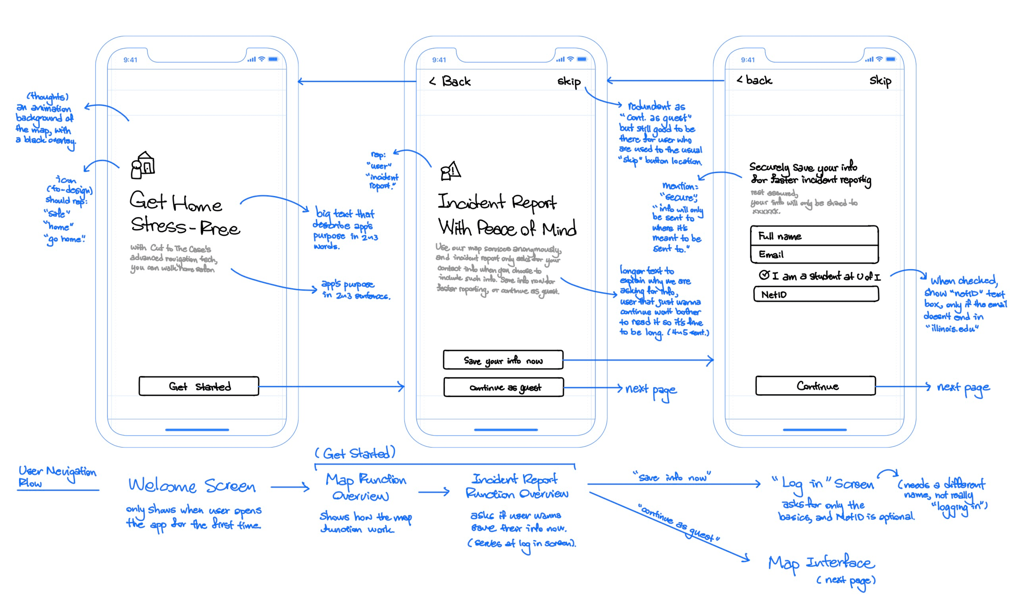
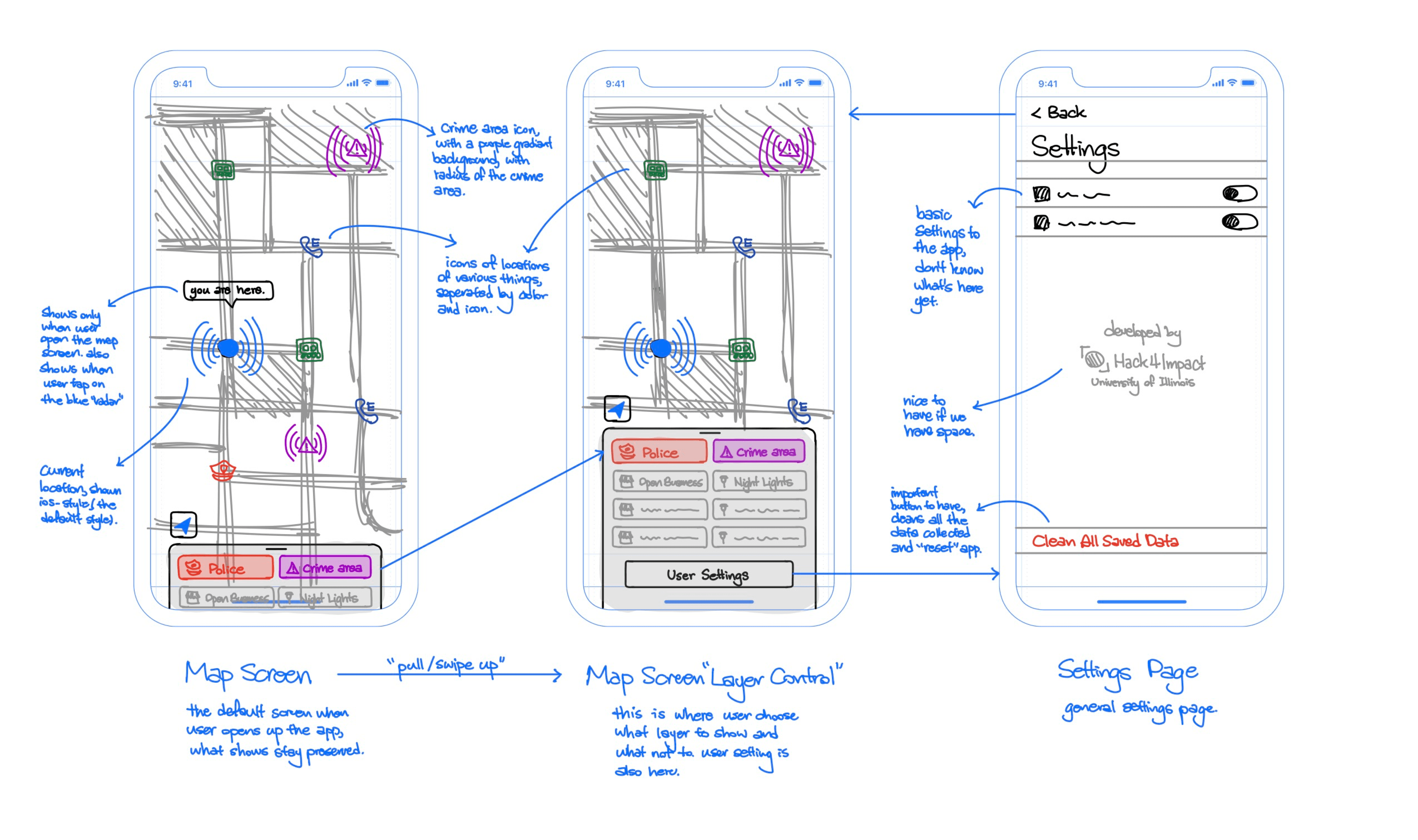
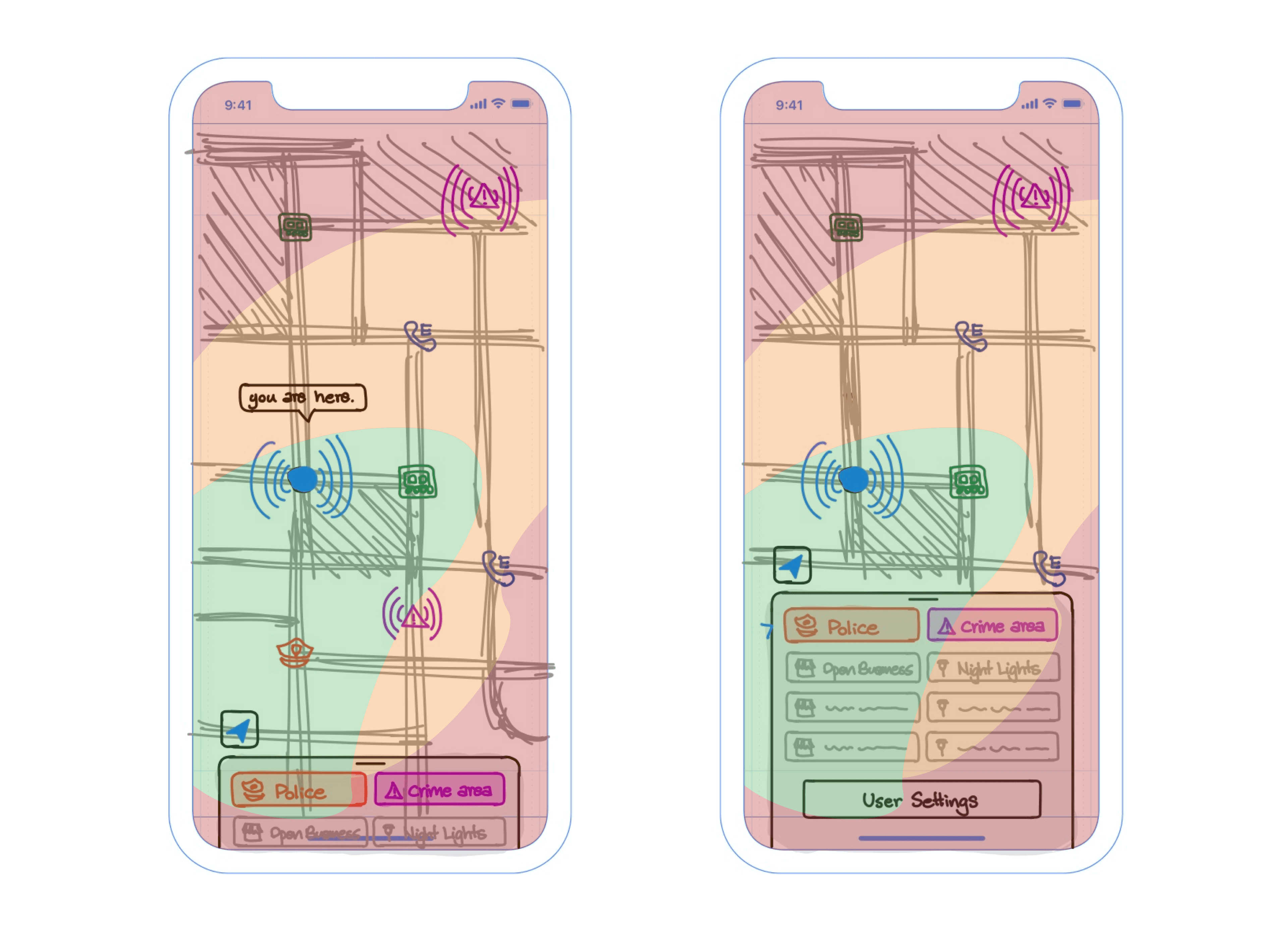
On our wireframe, we chose to have a map interface where users can see all types of relevant info directly on the map, sourcing directly from various established sources.
It took us a while to determine how we want the “info type filters” selection menu to look like. Eventually, we decided to make a card-style menu which users can swipe up and down because of the following reasons:
- the card-style menu is more easily accessible compared to other options like the hamburger “swipe-from-the-side” menu, according to a thumb-friendly heat map analysis; since we want the user to be able to get the info they need as quickly as possible, this is important
- it is similar in design to map apps users are already used to using, like Google and Apple Maps; since users might be using the app under emergency situations, we want the design to be intuitive and familiar
The wireframe provided the team with a general idea of how the app will look like so that they could get started in the development process. In the meantime, we started to plan and conduct user interviews and usability tests on our wireframe.
User Interview and Usability Tests
We used the results of the interviews and usability tests to justify and contemplate all the new design revisions.
“It’s late at night and you’re outside walking back home. There’s no one around you and it’s dark. What would you do next to make yourself feel safe?”
For the wireframe interview, this was our first question to all interviewees. After they answered the question, we introduced them the app concept and asked if it’s something they would download, as well as what features they would look for in such an app.
Finally, we did the usability tests; we showed them the interactive wireframe and watched how they interacted with the app.
“The presence of other university students alleviates my fears of walking alone through potentially dangerous routes.”
We made sure we interviewed people from different demographics, since apps from different regions sometimes incorporate different designs, and we want our app to feel familiar to what people are already using, making it more intuitive to everyone.
All of the 4 participants we interviewed (two freshmen, male and female, one junior, and one international student) followed our predicted design flow; they navigated through the app quickly without needing assistance. Some desired features they suggested include (1) integrating with bus times and (2) adding emergency call buttons.
Mockup 0
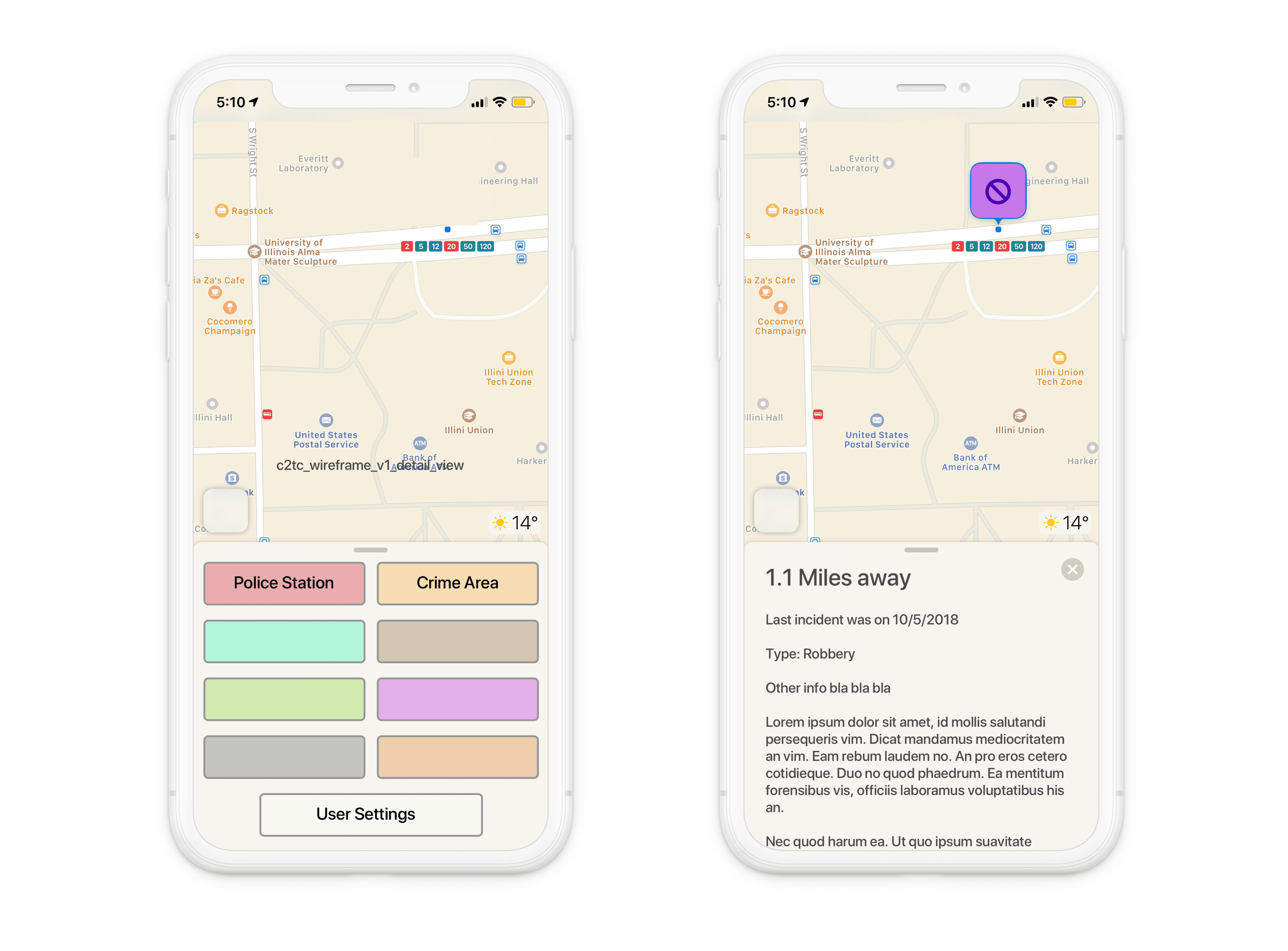
While transitioning from wireframes to mockup 0, we discussed how the detailed info of a specific icon on the map should be presented, if it should be presented at all.
Choosing it to show as a card was a tough choice, as we don’t want users to get confused having one more “card” showing up. However, we stuck with it because we thought there should always only be one thing on the screen: either the “filter selection” card, or the “detail” card; the later overlaps the other, and can be closed by tapping the “x” icon.
Mockup 1
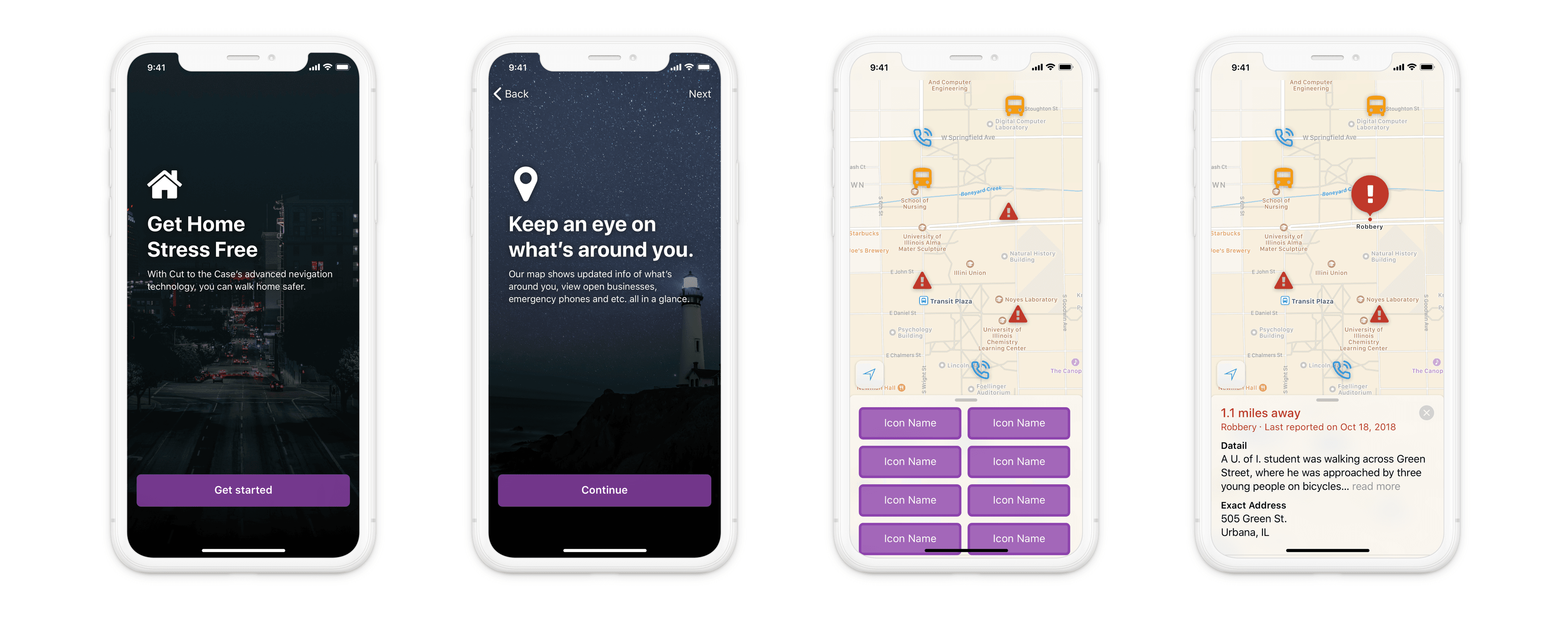
All screens that are seen on the wireframe is included. We used images with dark colors as the background for welcome screens because we envisioned that most people would be using the app at night, and we don’t want to disorient the users with bright backgrounds.
Mockup 2
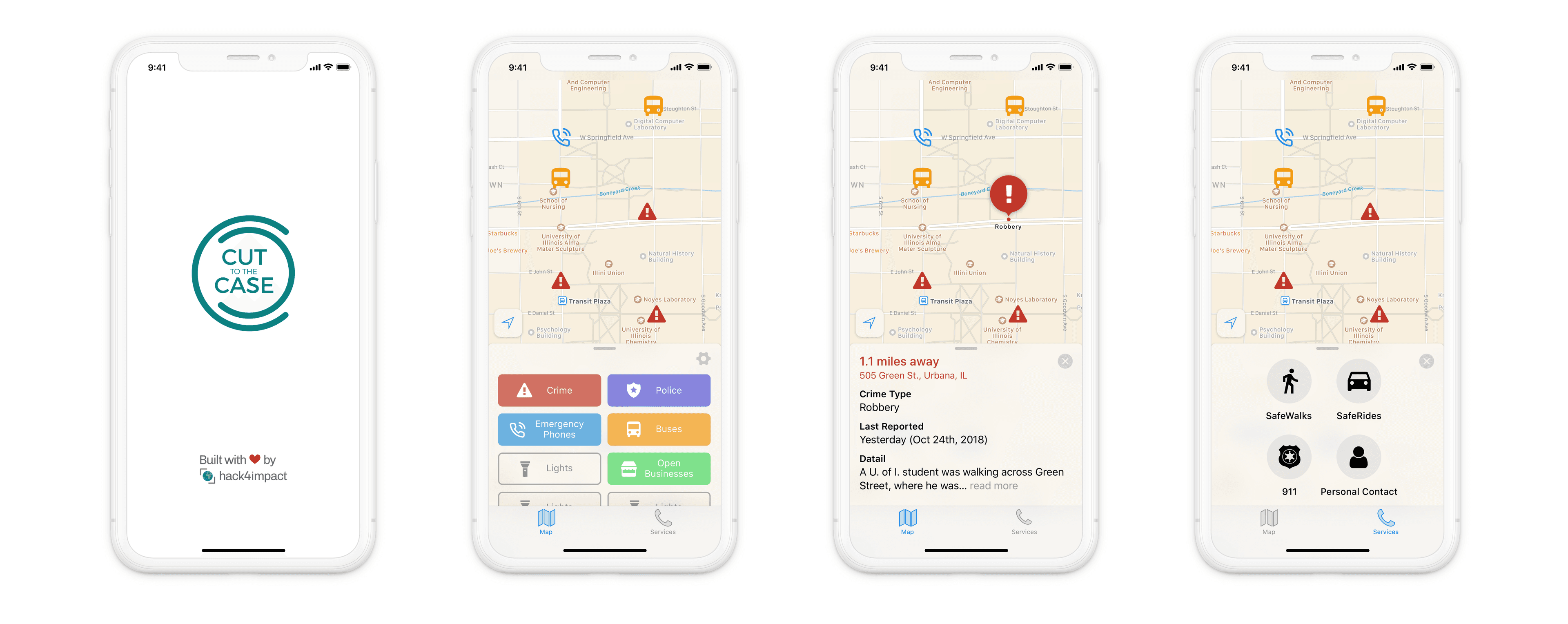
We incorporated some suggestions we got in the interviews into this mockup. To add the calling features, we had to introduce a new element to the design, separating this functionality from the “filter selection” function.
We thought about adding a hamburger menu on the upper left of the screen, however, that doesn’t follow the iOS Human Interface Guidelines — which was our priority platform at the moment — and it is not easily accessible.
We end up adding a tab at the bottom for users to switch the card since it provides a more intuitive navigation flow: users are either on the “filter selection” card or the “calling” card, there are no other options. By default, “filter selection” card will be shown.
We also changed how the info is organized on the “detail” card in this mockup, specifically because we want the users to focus on the info that’s more important to them. For example, we learned from the interviews that users find the exact crime location more important than crime types, because users would usually like to avoid all types of crimes.
“I like how the info on detail cards is brief and straightforward, but I’d like to also know if a student/faculty was involved.”
Mockup 3
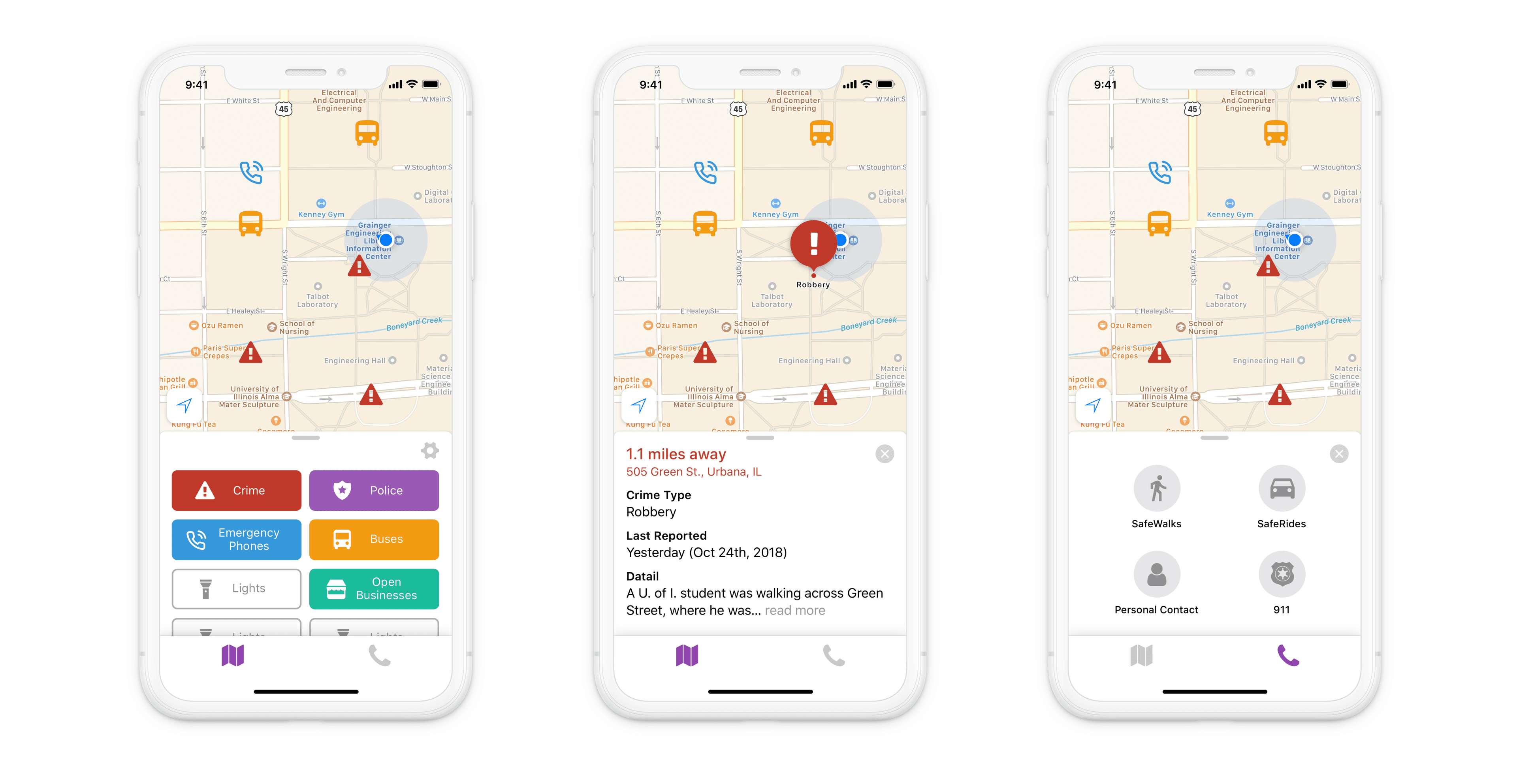
We made the backgrounds of cards non-transparent to better separate it from the map. We also chose purple to be the primary color of the app, since it calms the mind, which could potentially help nervous users.
Mockup 4
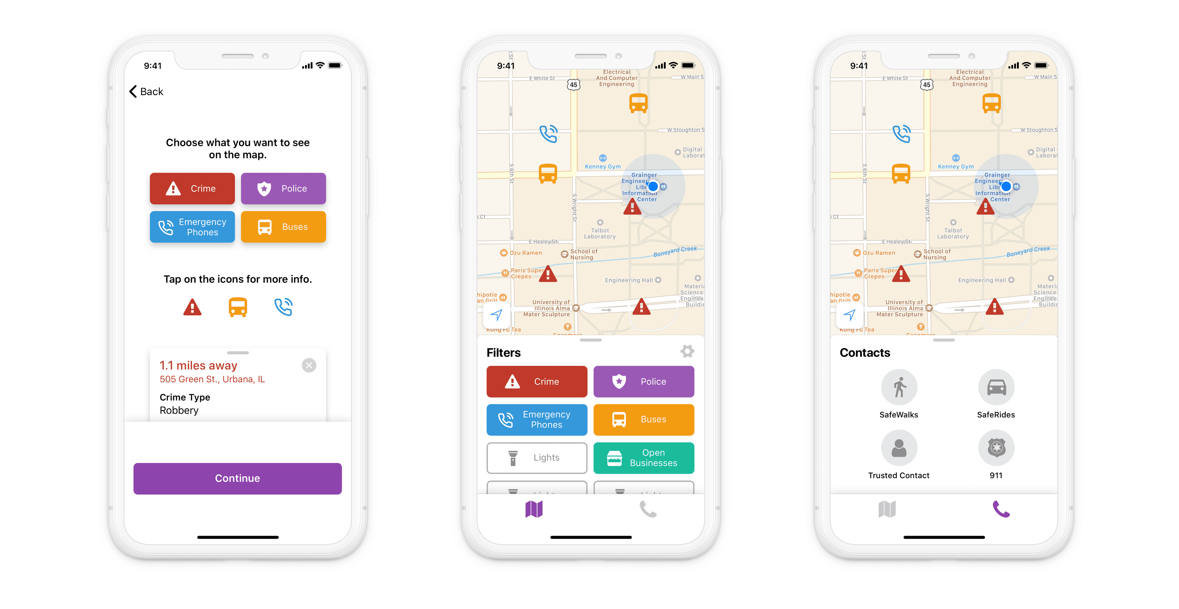
In our usability tests, we observed a behavior pattern that some users, especially international students, would skip through all welcome screens, not reading the copy text there. They mentioned that seeing so much information presented in their second language, it’s just not visually appealing.
To address the issue, we redesigned the screens and made them into one intro screen, which shows only the most necessary information. We also reduced the amount of text and added more visual elements, as well as animations.
Another change was the introduction of title copy on cards. We added a title to both the “filter selection” card and “detail” card, to help users distinguish the two.
The Solution
After several iterations of the design and multiple rounds of user interviews and usability tests, we proceeded to create a high-fidelity interactive prototype of the app using Sketch.
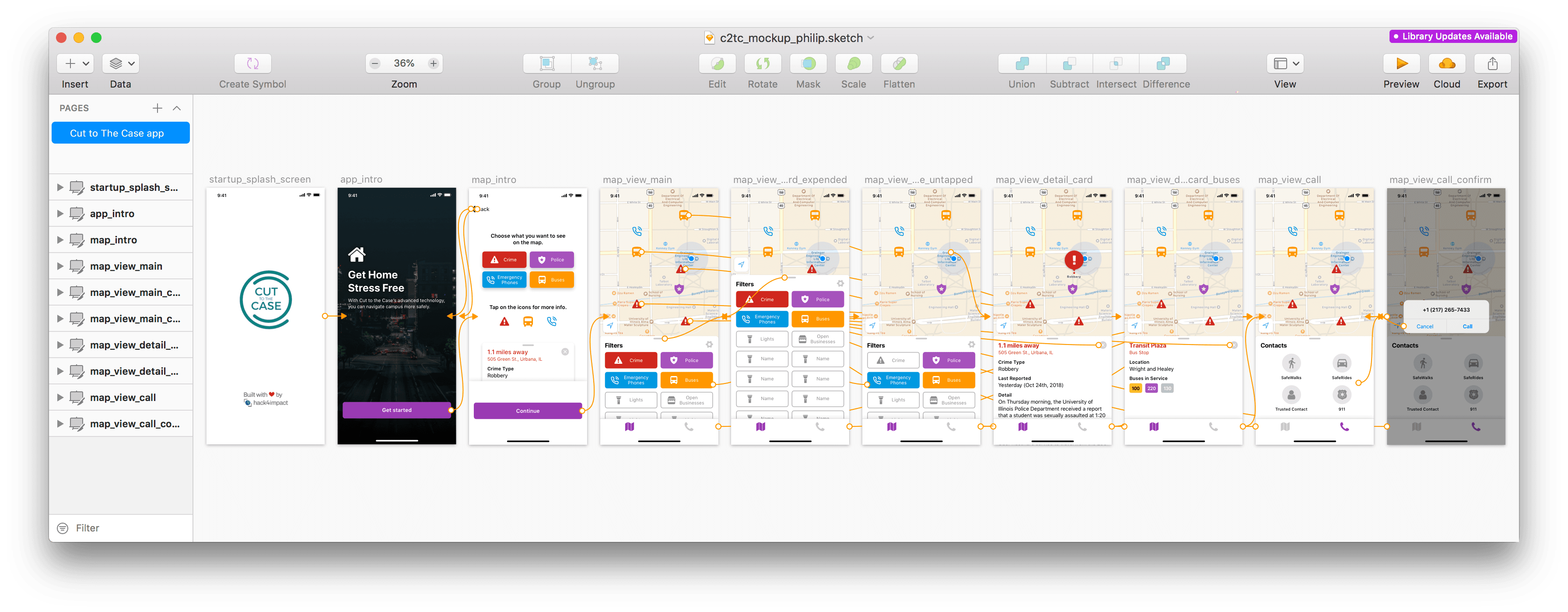
The image shows the key and desired navigation flow of the app. We have also created a video version of this demo.
Upon opening the app for the first time, users are greeted by the intro screen, where they learn about the main functionalities of the app. Continuing to the main map view, they can view their current location and observe what’s around them. Other functions are also showcased in the image.
The Outcome
The high-fidelity prototype successfully addressed both the pain points described above as well as the user needs.
Our solution enables the user to view relevant information that could enhance their personal safety, organized beautifully in an easily accessible mobile app that has an intuitive user experience, helping people feel safe walking at night at the University of Illinois.
The design received very positive feedback from the client, Cut to The Case. It also received praise from other teams during the Hack4Impact End of Semester Showcase.
The project aims to use human-centered design principles to deliver an effective user experience for all users, especially those that are under emergency situations and need to find relevant information very quickly. Additionally, the design is scalable and can be applied to other cities. Hopefully, with our solution, students can walk home more safely at night.