Crafting Amperos Brand Identity
Design Ideas
When we set out to rebrand Amperos, the brief was deceptively simple: make an AI company in healthcare billing feel trustworthy. Most of our competitors reach for the same visual vocabulary — electric blues, abstract neural nets, gradients borrowed from crypto landing pages. None of it says anything about the people whose claims actually get processed.
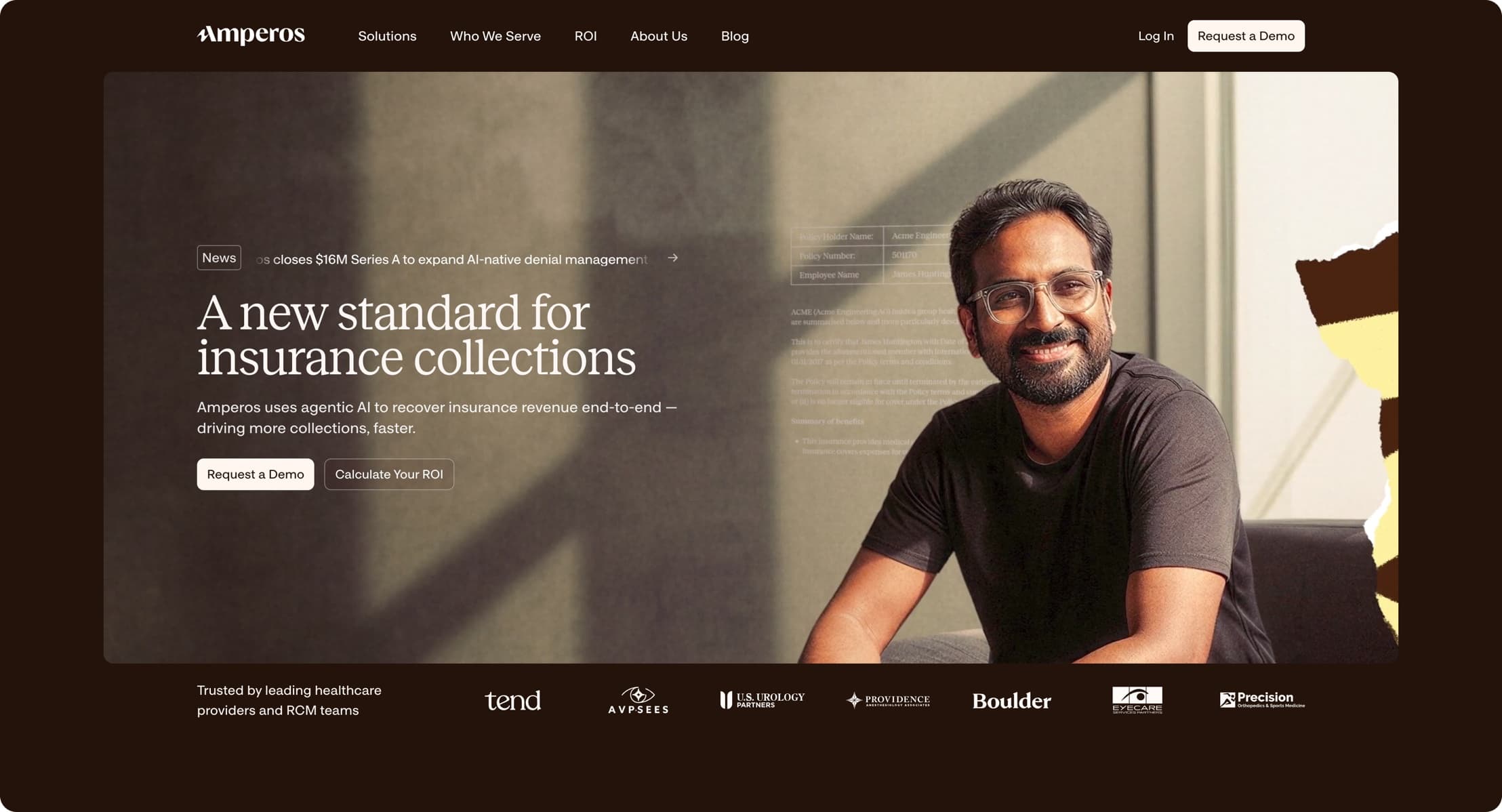
We went the other way. Warm paper tones, editorial serifs for the marketing voice, and photography of real clinicians in real light. The hypothesis was that trust is built from restraint: the fewer tricks the surface pulls, the more credible the claims underneath it feel.
Process
The identity started with the wordmark. We tried close to forty directions before landing on a modified serif with a slightly flared terminal on the A — a nod to the ampere symbol without turning the logo into a physics joke. The flare is subtle enough that most people never consciously notice it, which is exactly the point.
Color came next, and it was the most contested decision of the project. Healthcare branding oscillates between hospital teal and pharma blue, and both carry baggage. We settled on a deep espresso brown as the primary surface color, paired with a warm cream. Brown is rare in the category, photographs beautifully, and makes the product UI — which stays clinical and neutral — feel like a different room in the same house rather than a different company.
Typography followed the same split. The marketing site speaks in a high-contrast serif that can afford to be opinionated; the product speaks in a quiet grotesque that gets out of the way. The two share spacing, radii, and iconography, so moving from the site into the app feels like a change of register, not a change of speaker.
The hardest part was the photography direction. Stock imagery of doctors pointing at tablets was banned on day one. We commissioned a single shoot with one clinic, natural light only, and asked the photographer to treat it like documentary work. Half the shots were unusable. The other half carried the entire brand.
Takeaways
Restraint is a positioning strategy, not just an aesthetic one. In a category where every competitor is shouting about AI, the calmest voice in the room reads as the most confident — and confidence is what people buy when the product touches their revenue.